Experience Your UX Leadership Journey

Our team is focused on providing you — the leaders and makers of awesomeness in your organization — the skills, mindset, and confidence you need to be the UX leader your team needs.
Discover the ways we could help you solve your biggest challenges. Discover your UX Leader journey with us.
Everything Center Centre does:
Become a more strategic leader through our live and recorded programs:
- Join Leaders of Awesomeness
- Level Up Your UX Strategy Essentials
- Craft UX Strategies in Live Intensives
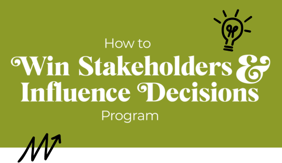
- Win Stakeholders & Influence Decisions
- Lead your organization strategically in talks, workshops, & coaching with Jared Spool.
- And we encourage you to continue to connect and grow with us.