
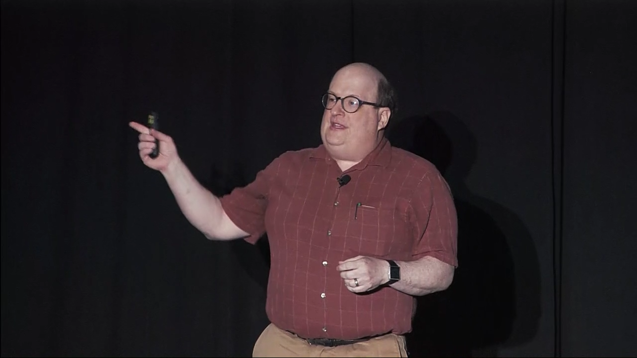
Jared Spool Visits You
Have Jared give his world-famous talks right at your office.Experience Design is a competitive advantage and you need that advantage now.
There’s no better way to start gaining that advantage than having Jared Spool engage with members of your organization. Whether you need to start or improve a conversation about UX experience, Jared’s presentations introduce the UX concepts and vocabulary that gets your entire organization on the same page. If you’re looking for strategic insights or tactical processes, Jared will deliver the necessary goods with one of these seven highly rated talks (you really can’t go wrong with any of them) and the best part, Jared delivers it live!Who is Jared Spool?

 Jared M. Spool is a Maker of Awesomeness at Center Centre – UIE. Center Centre is the school he started with Leslie Jensen-Inman to create industry-ready User Experience Designers. UIE is Center Centre’s professional development arm, dedicated to understanding what it takes for organizations to produce competitively great products and services.
In the 43 years he’s been in the tech field, he’s worked with hundreds of organizations, written two books, published hundreds of articles and podcasts, and tours the world speaking to audiences everywhere. When he can, he does his laundry in Andover, Massachusetts.
Jared M. Spool is a Maker of Awesomeness at Center Centre – UIE. Center Centre is the school he started with Leslie Jensen-Inman to create industry-ready User Experience Designers. UIE is Center Centre’s professional development arm, dedicated to understanding what it takes for organizations to produce competitively great products and services.
In the 43 years he’s been in the tech field, he’s worked with hundreds of organizations, written two books, published hundreds of articles and podcasts, and tours the world speaking to audiences everywhere. When he can, he does his laundry in Andover, Massachusetts.
The Talks
Beyond The UX Tipping Point#
For the longest time, making a great experience for the user was a business-strategy luxury item. A great product only had to work and ship. A great experience was a nice-to-have, not a requirement. Times have changed. The cost of delivering a product is no longer a barrier to entry. Quality is no longer a differentiator. What’s left? The user’s experience.
Every part of the organization must be infused with an understanding of great design. Your organization has to cross the UX Tipping Point. You must increase everyone’s exposure to users, communicate a solid experience vision, and install a culture of continual learning. With that, design will become your organization’s competitive advantage.
Jared will show you and your team:
- Which path organizations take to become design-infused
- How a centralized UX team is a stepping stone to a more UX capable organization
- Why the market needs to demand a better experience before it will matter
- What your organization will need to do to cross the UX Tipping Point
This talk is 77 minutes.
 Watch this full talk now
The Evolution of a New UX Design Resolution#
Pull back to an organization level, working to connect applications and other services together.
Design Works on Many Levels
Looking at design through different levels of resolution helps us answer some important questions. Is there a difference between UX and UI, and if so, how does that change how teams should operate? What is the relationship between product design and service design? How do we start preparing for what comes next?
An alternative is a well-designed process for creating your designs. The secret sauce in that well-designed process is a realization and inclusiveness of everyone on the team. It’s infused with an understanding of how people contribute to the design process, even when they aren’t trained in design skills. And it opens up opportunities to give everyone—not just your trained designers—the superpowers necessary to rid your products and services of bad design.
This talk will inspire you and your team to:
- Avoid the dangerous trap of thinking too narrowly about your career
- Understand the relationship between pioneers, settlers, and town planners, when it comes to design craft.
This talk is 73 minutes.
 Watch this full talk now
Design is a Team Sport#
Every seasoned designer has fallen into the trap. They see the bad design in front of them. They can’t help but see how bad it is. And they want to redesign it. Show the world how it could be done. How it should be done.
Well-intentioned as the desire to rid the world of this bad design is, their approach often is a disaster. It pushes their allies away, accidentally giving off the air of superiority filled with the smells of arrogance and contempt.
An alternative is a well-designed process for creating your designs. The secret sauce in that well-designed process is a realization and inclusiveness of everyone on the team. It’s infused with an understanding of how people contribute to the design process, even when they aren’t trained in design skills. And it opens up opportunities to give everyone—not just your trained designers—the superpowers necessary to rid your products and services of bad design.
This talk will inspire you and your team to:
- Realize the reason everyone thinks they are a designer is they are a designer, however unskilled
- Learn that our design processes need to be designed, with intention and thoughtfulness
- Focus on helping every contributing influencer of your designs become a consciously competent designer themselves
This talk is 45 minutes (60 minutes with Q&A). A 30 min version is also available.
 Watch this full talk now
Building a Winning UX Strategy Using the Kano Model#
The ultimate goal for user experience is that users enjoy using your product or service. Many companies use satisfaction as a metric for measuring their success. But satisfaction is really just the lack of frustration. You should focus on how you’ll delight your users.
Building a roadmap based on product features locks you into a technological solution that may cause problems down the road. However, by shifting your strategy to solve customer problems, the user experience becomes the focus of the design process.
In this session, Jared presents the Kano Model, which helps you gauge your users’ expectations. When you approach delight from a perspective of pleasure, flow, and meaning, you can then determine which features meet these objectives.
This talk will show you and your team:
- How to identify your customers’ basic expectations
- How adding features today creates more work for teams downstream
- How to focus the team on real customer problems, avoiding the problem of experience rot
This talk is 45 minutes (60 minutes with Q&A).
 Watch this full talk now
Insecure & Unintuitive: How We Need to Fix the UX of Security#
“Which username did I use?”
“Do they want my email address or my nickname?”
“Which password did I use?”
“What was my favorite vegetable when I created this account?”
Nothing wrecks a great user experience like a login form. Our password rules make it hard to remember what we’ve used, and stupid security questions lock us out of our accounts. And none of these security gymnastics actually prevent our personal information from leaking into the world. (In fact, we often inadvertently make it easier.)
If it’s not usable, it’s not secure. Unusable authentication systems are a bellwether of poor end-to-end experience. Once you’ve frustrated a user with their account creation or session authentication, it’s extremely hard to win them back.
Security isn’t sexy, but when we get it right, we reduce risk and increase user satisfaction. In this entertaining presentation, Jared will explain how to make authentication design a top priority in your experience architecture. He’ll show you where the real risks are and why you shouldn’t trust others to handle your design’s security elegantly.
Jared will show you and your team:
- Security without frustration
- Amazon’s multi-state security model that reduces fraud and makes money
- How to keep the Paranoids at bay without degrading the user experience
This talk is 60 minutes (75 minutes with Q&A).
 Watch this full talk now
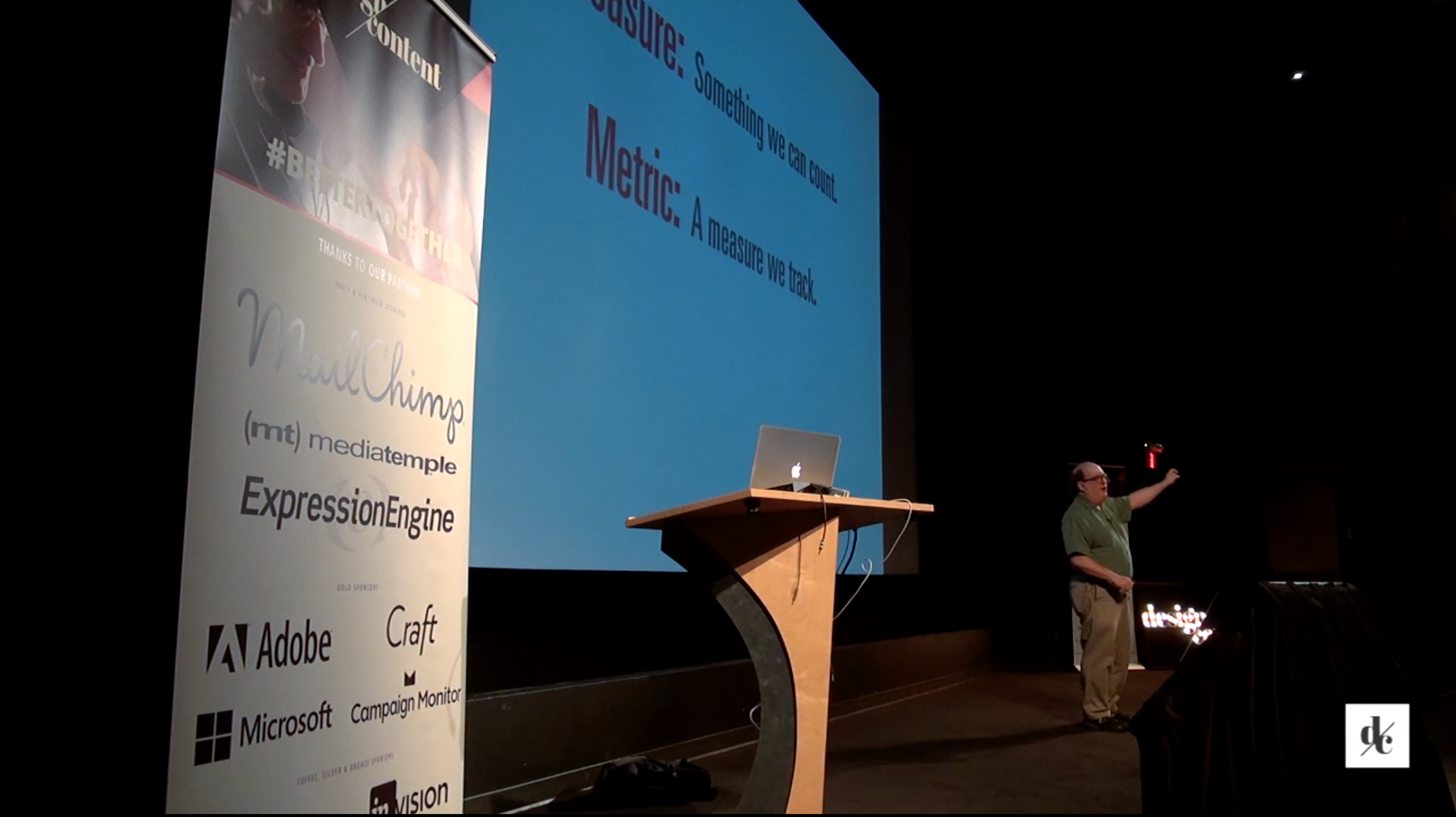
Is Design Metrically Opposed?#
The world of metrics and analytics have often been at odds with how designers work. Design is a process where we finely tune our intuition to create great user experiences. Yet, sometimes, what we think is best rivals the metrics. So which do we believe-our gut or the data?
In the world of measures, metrics, and Key Performance Indicators some practices, like the growth hacking approach to increasing Monthly Average Users (MAUs), have hurt the online experience of Instagram and LinkedIn. While alternatives to satisfaction and net promoter score give insight into the design process and help designers have better instincts.
If you’re ready to talk to your teams about what you really need, help management interpret the data, and create analytical experiments that provide design insights, don’t miss this talk.
This talk will show you and your team:
- What easily-collected analytics, like bounce rate and time-on-page, actually tell us about our users’ experiences
- Why advanced techniques, like a money-left-on-the-table analysis and the CE11, show us how metrics can impact design
- Why asking, ”Would you recommend this?“ isn’t an ideal way to measure brand engagement
This talk is 60 minutes (75 minutes with Q&A).
 Watch this full talk now
It’s a Great Time To Be a UX Designer#
There’s never been a better time to be a designer. After years of wishing we’d have the recognition and appreciation for the value we bring, we’re now highly sought after for our talents and skills. A growing number of organizations have seen success through great design, from Apple to Cirque de Soleil to the White House and the demand for great designers has never been better.
But creating great experiences needs a new breed of designer. One that can handle all the skills involved, from visual design to coding. Some might even call it a “unicorn,” but these creatures aren’t mythical. In fact, they are alive and thriving in today’s design teams.
This talk will show you and your team:
- Why it has never been a better time to be a designer
- What the new breed of designer must handle to meet the demand of being a great designer
- Why Jared believes in unicorns and how they are thriving in the design teams of today
This talk is 60 minutes (75 minutes with Q&A).
 Watch this full talk now
UX Strategy Means Business#
We are in an age where poor user experiences become the focus of nationwide attention. One doesn’t need to look beyond recent catastrophes, such as Apple’s iOS6 Maps, Healthcare.gov, and the demise of Blackberry’s smartphone, to see the necessity of getting the experience right.
Yet what do we know about ensuring our next design isn’t going down the same road as those that have failed before us? We need to understand how design integrates with our organization’s strategy, to ensure we’re supporting and enhancing it, not taking away from it.
In what may possibly be his most entertaining presentation ever, Jared shows you how to integrate user experience strategy with your business’s objectives. He explores the world of business models, demonstrating the role a UX strategy plays in providing significant value to the organization’s bottom line.
This talk will show you and your team:
- How an expanded notion of content is critical to understanding the value of user experience
- Where to tailor your design strategy to the five priorities every senior executive cares about
- Which of the emerging business model variations for content might be the right direction for your business
This talk is 60 minutes (75 minutes with Q&A).
 Watch this full talk now